Navigating Project Progress Transforming workspace reports for smarter decision-making.
Context
ProjectPlace offers a wide range of powerful collaborative work management capabilities that enable anyone, in any business function to plan and execute work with their teams, track progress in real time, and ultimately achieve goals.
Workspace administrators can use workspace reports to monitor and share progress of their projects with internal and external stakeholders. Widgets on the Reports page are fully customizable, so users can control how reports look for specific workspace.
The Problem
Many users have expressed frustration with the lack of comprehensive reporting tools within our platform, often citing comparison with our competitors which offer robust reporting functionalities. As a result, there is a clear gap in our app's feature set, hindering users' ability to effectively track and analyze project progress, performance, and outcomes.
Accessing and visualizing project data in a meaningful way poses a challenge, as users currently rely on external tools or manual processes to generate reports. Also some customers reported GDPR issues when using some external reporting tools.
My role & responsibilities
My primary responsibilities inlcude user research, information architecture and visual design. I was also the scrum master for the team.
We were a small team of 6 and took around 14 weeks to complete the project.
Objective
The objective of this project is to design and implement a robust reports dashboard within our project management web app, empowering users to easily access, visualize, and analyze project data in real-time. By addressing this critical feature gap, we aim to enhance user satisfaction, improve productivity, and strengthen our competitive position in the market.
Research
The aim was to gather insights into user preferences, pain points, and expectations regarding in-app reporting capabilities within our project management app. The findings will inform the design and development of an intuitive and comprehensive reports dashboard to enhance user satisfaction and productivity.
Online surveys
Conducted surveys targeting current users of the project management app to collect quantitative data on their usage habits, reporting needs, and preferences.
Interviews
Conducted semi-structured interviews with a diverse group of users to delve deeper into their experiences, pain points, and desired features related to reporting.
Key findings
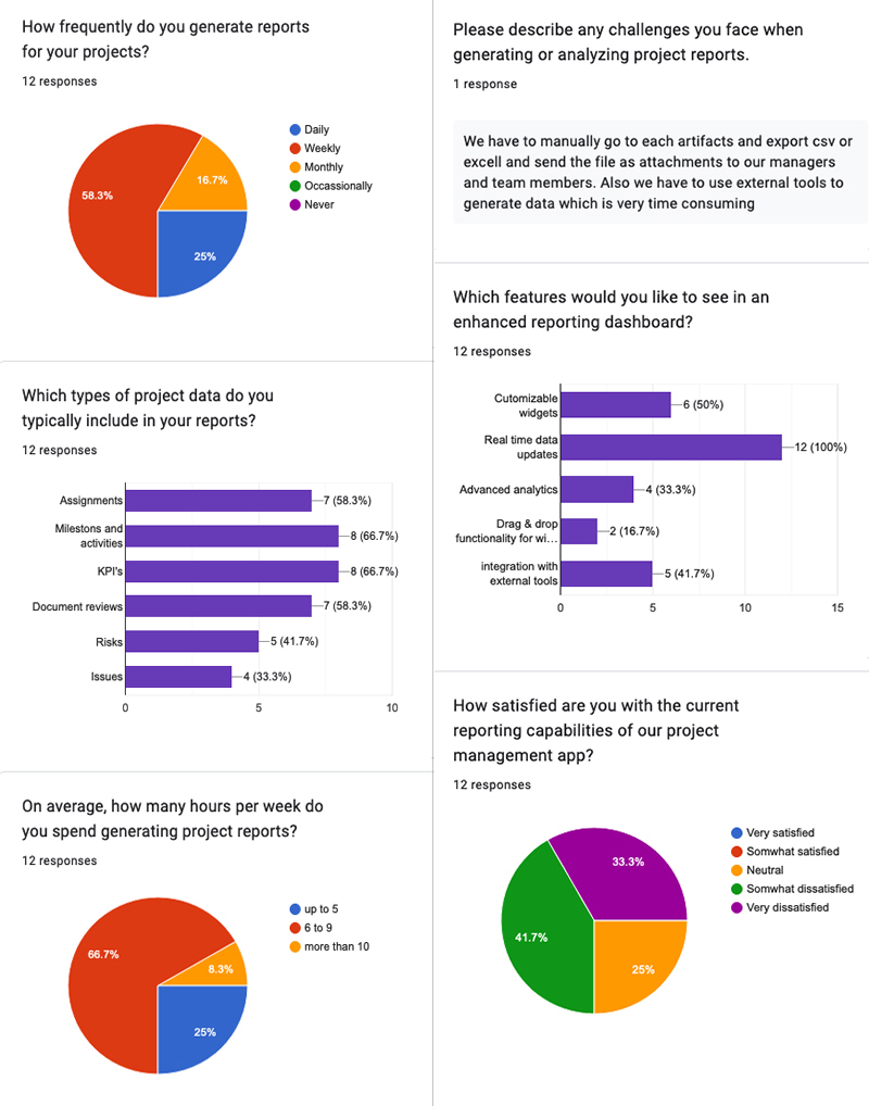
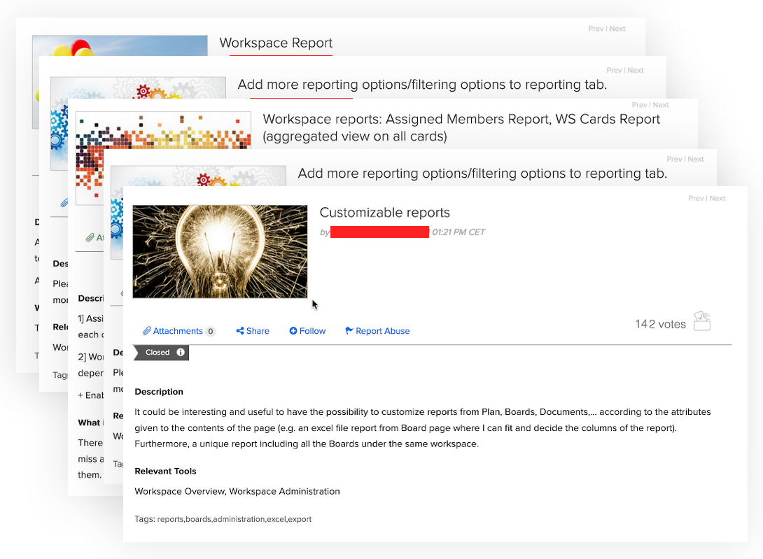
- Over 70% of surveyed users reported frustration with the lack of in-app reporting capabilities, citing the need to rely on external tools or manual processes. Common pain points include difficulty in accessing relevant project data, generating comprehensive reports, and sharing insights with team members.
- Users expressed a strong preference for an integrated reports dashboard within the app, enabling seamless access to real-time project data and analytics. Customization options, such as the ability to select specific metrics, filters, and visualizations, were highlighted as key expectations.
- Many users mentioned comparing our app with competitors such as Asana, Wrike, and Smartsheet, particularly in terms of reporting capabilities. Feedback from users who have experience with competitor platforms emphasized the need for our app to offer similar or superior reporting features
- Interview participants provided insights into specific use cases where in-app reporting would be beneficial, such as tracking project progress, identifying bottlenecks, and analyzing resource allocation. Scenarios involving cross-functional collaboration and client reporting were also highlighted as important considerations.
Implications
Based on the research findings, the following design considerations are recommended for the development of the in-app reports dashboard:
- Seamless Integration: Prioritize the integration of reporting features within the app interface to enhance usability and accessibility.
- Customization Options: Provide users with flexible customization options to tailor reports according to their unique project requirements and preferences.
- Data Visualization: Implement dynamic data visualization techniques to enable users to track project performance and trends in real-time.
- User Education: Develop onboarding materials and tooltips to educate users about the new reporting features and promote adoption.
The Design
Features
- Users require flexibility in customizing reports to align with their specific project requirements. This includes the ability to select relevant metrics, apply filters, and choose visualizations. We implemented a drag-and-drop feature for easy arrangement of widgets.
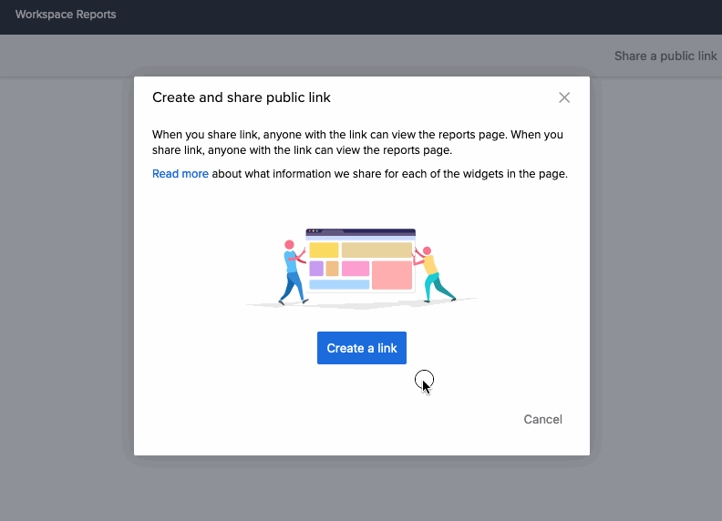
- The application allows users to share the reports page with external stakeholders public link, facilitating seamless collaboration and communication. We have dropped PDF generation of reports dashboard due to technical limitations/lack of time as per the Product managers prioitization decisions.
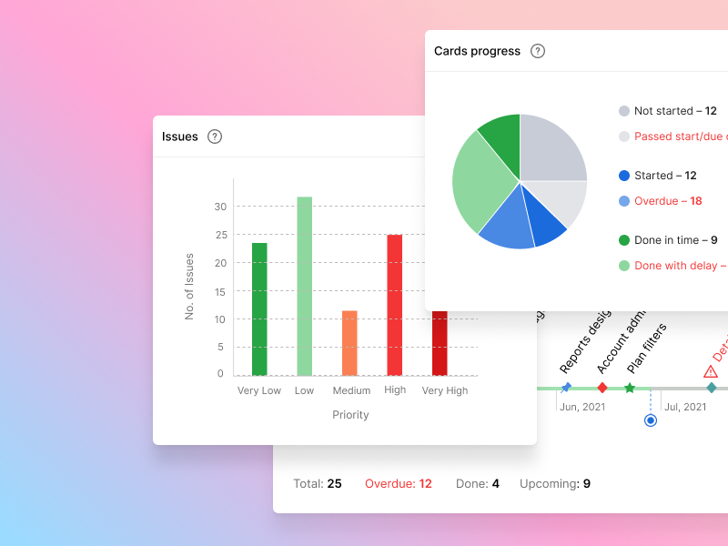
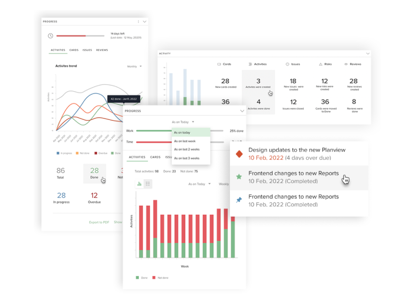
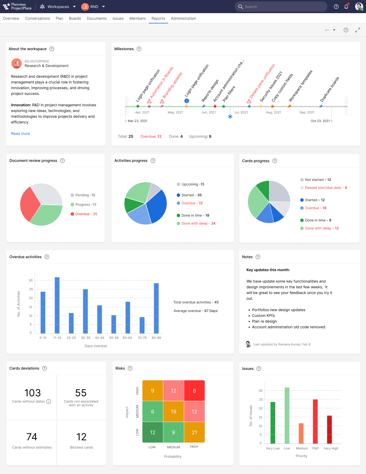
Widgets
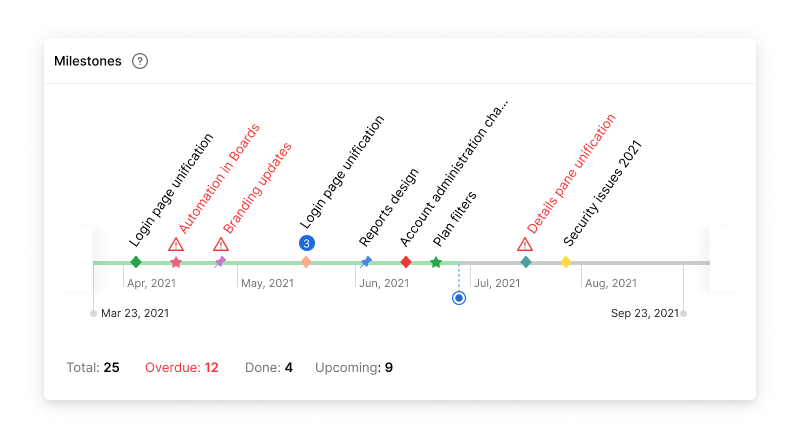
The reports dashboard provides an overview of project progress, focusing on key artefacts within ProjectPace: Documents, Cards, Activities, and Milestones. After extensive workshops and stakeholder discussions, the following categories and widgets were identified:
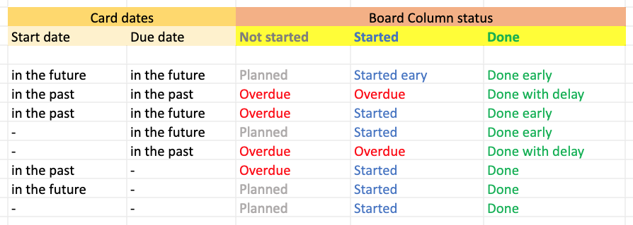
- Progress Tracks the progress of project artefacts that are on schedule.
- Delayed: Highlights artefacts that are behind schedule, requiring attention and mitigation.
- Overdue: Identifies artefacts that are overdue, signalling potential bottlenecks and risks to project timelines.
During discussions with customers, it became evident that while the initial categories sufficed, users desired more flexibility in widget selection. As a result, individual widgets were developed for each category, allowing users to tailor their dashboard to their specific needs. We developed a total of 16 widigets.
To further enhance usability, the ability to rearrange widgets through drag-and-drop functionality was implemented. This empowers users to organise their dashboard according to their preferences and priorities, ensuring a personalised and efficient reporting experience.
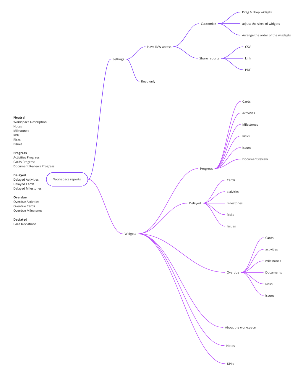
We summarized our understandings into following mind map.
We have categorized all the widgets into 5 parts(Neutral, Progress, Overdue, Delayed and Deviated) as seen in the below mind map.
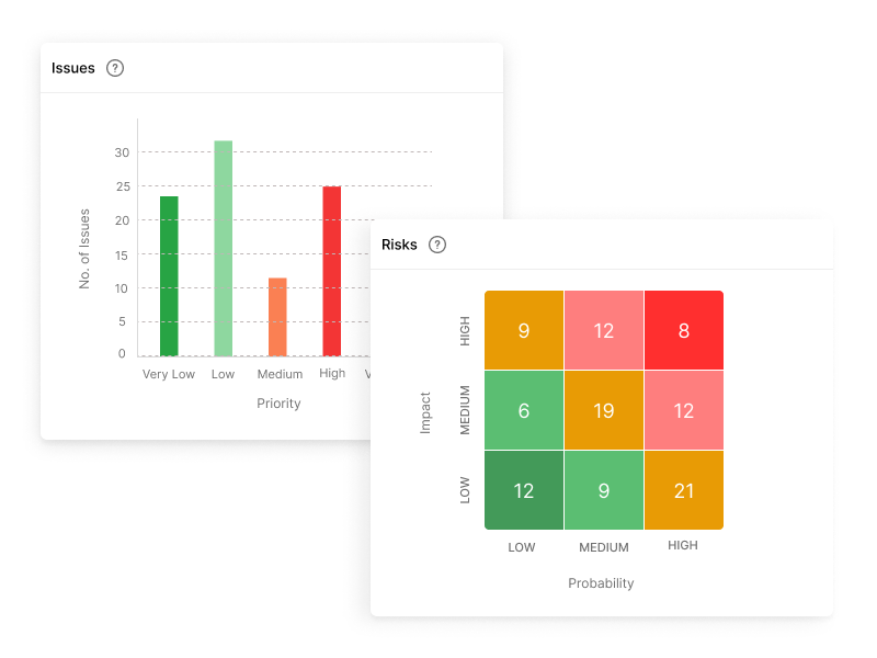
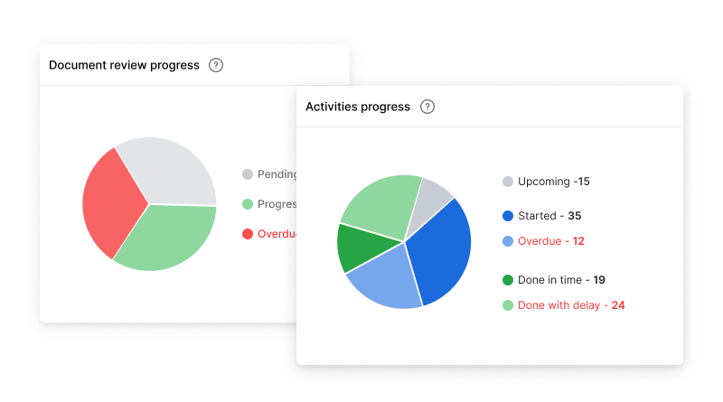
Once, we finalized the information architecture to develop widgets, it was time to think about what is the best graphical representation for each widget. Based on the category we have considered the following:
| Widget category | Graph visualization |
|---|---|
| Neutral | Informative |
| Progress | Pie chart |
| Overdue and Delayed | Histogram |
| Deviated | Number |
Elimintaed designs afer user feedback
These following initial designs were not considered, as the widgets comibined one or more artifacts in one widget, which made users frustrated as they were not customizable.
Final designs
After few iterations, here are the final designs that were pushed to prodcution.
Learnings
The findings highlighted the importance of features such as customizable widgets, real-time data updates, and advanced analytics in an enhanced reporting dashboard.
More transparent and data driven designs play a major role in project delivery. Majority of the Project managers and other stakeholders expressed their love towards the new designs and experience. Also the design solved their majority of problems such as time to export reports or sharinf them to potential stakeholders.
Next steps
We have dropped the idea of pdf generation of reports due to some technical and availability of time. So the pdf (also the csv/excel) export is planned for the future release.
More drill-down of the graphs is also planned. We need to adress the access rights in the system to expose more data to those who have read access rights. Currently we are showing only the summary and not the actual artifact detail.s